


Optimizing the job-posting journey
A services marketplace where customers post renovation, furniture, and interior projects and professionals respond. I redesigned the customer journey from the first visit to choosing a professional.
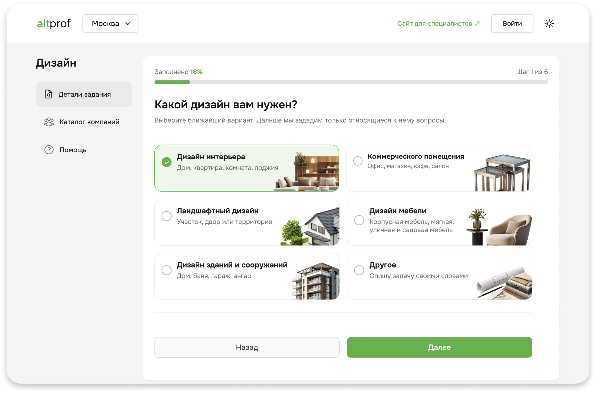

- Role
- Senior Product Designer → Lead Product Designer
- Timeline
- May 2024 — September 2026
- Industry
- Services marketplace, 20K+ MAU
- Contribution
- Research, analytics, interface design, specifications
About the product
A two-sided marketplace connecting customers with companies and independent professionals.
Altprof is a services marketplace: customers post renovation, furniture, interior design, and construction jobs, while companies, manufacturers, and independent professionals respond.
The product serves both sides. Customers need a reliable professional who can deliver what they have in mind without hours of calls, comparisons, and checks. Companies and manufacturers need relevant orders without cold outreach.
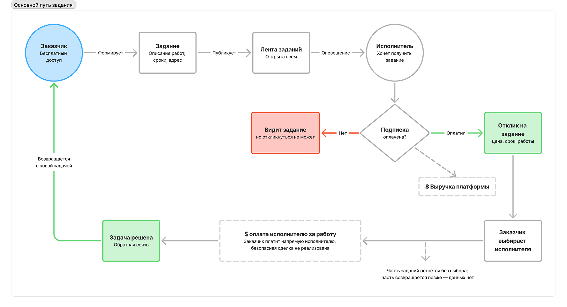
Professionals pay for access to job posts; customers pay nothing. This makes one journey critical to the whole business: a customer publishes a job, receives estimates, and chooses a professional. Until a job is published, professionals have nothing to respond to and no reason to pay for access.
I joined the project in October 2024, just after an external team delivered the MVP. I mapped how the product worked, identified where it was losing customers, and proposed taking ownership of this journey.
This journey drives the core revenue, so I started here.
Challenge
Increase the number of published jobs and make the customer journey measurable.
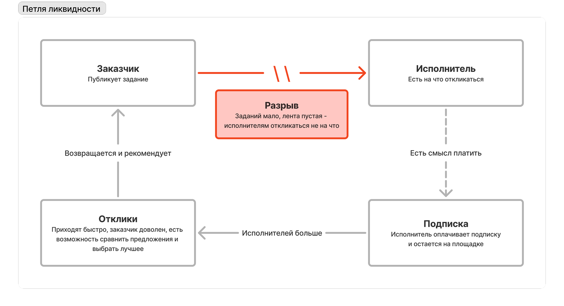
Customers and professionals on the platform depend on each other. More job posts give professionals more opportunities and more reasons to stay and renew their subscriptions. More active professionals mean customers receive responses sooner and get the work done.
The problem started with too few job posts. Professionals had fewer suitable opportunities, visited less often and stopped renewing. Customers waited longer for responses or received none at all.
I prioritized the customer journey. Recruiting more professionals made little sense at this stage: without more published jobs, the underlying problem would remain.
The challenge had two parts: increase the number of published jobs without compromising their quality, and set up customer journey analytics to understand where customers drop off.
Design process
How I made evidence-based decisions without existing analytics and under tight deadlines.
The product was at an early stage, analytics were missing, and time was tight. The goal was to make sound decisions quickly and move them straight into development.
- Analytics and SEO setupThe MVP had no tracking, goals, session replay, or search optimization. I assembled the team, scoped the work, and built the first funnel.
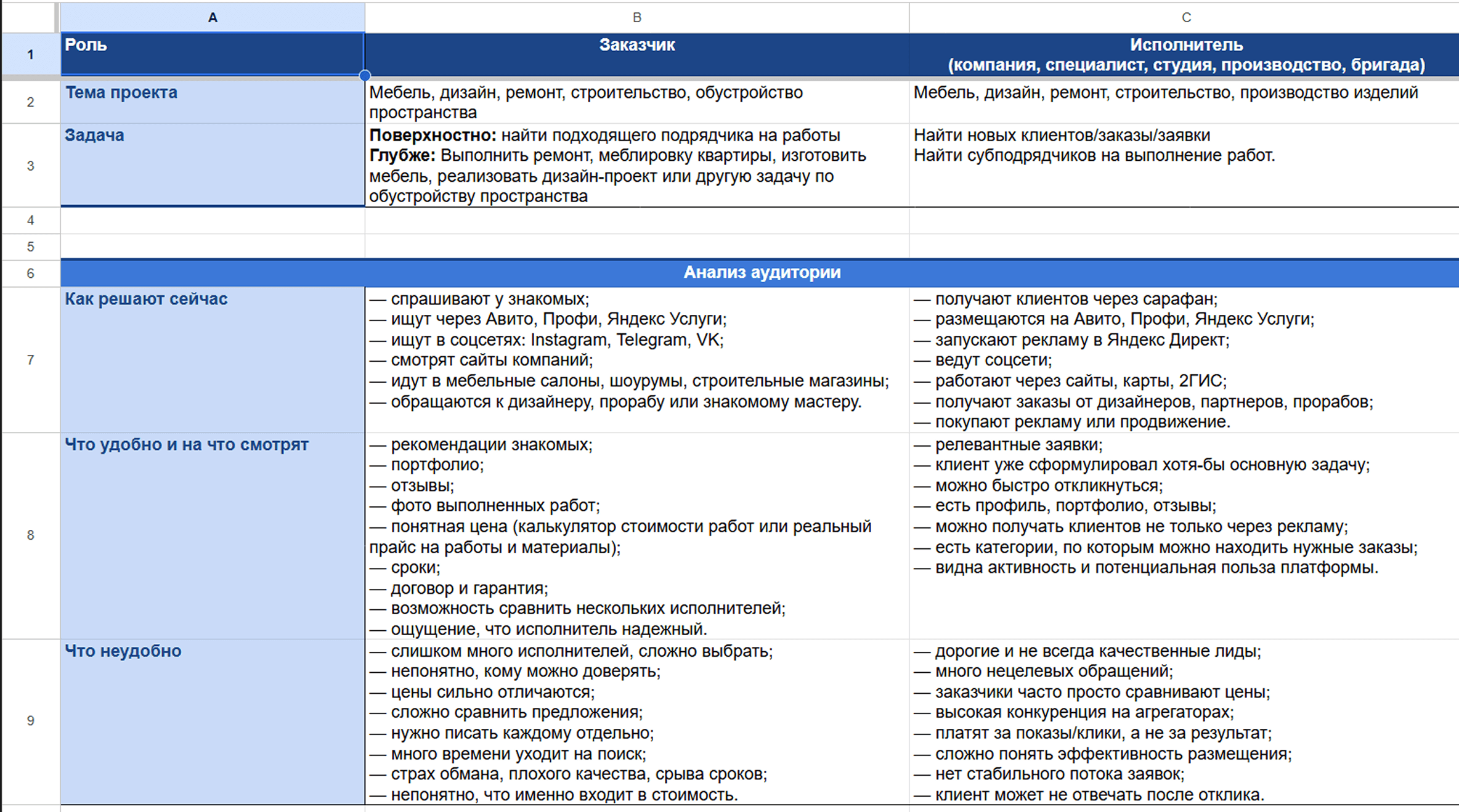
- Understanding the domainI mapped roles and permissions, the category structure, and customer acquisition sources.
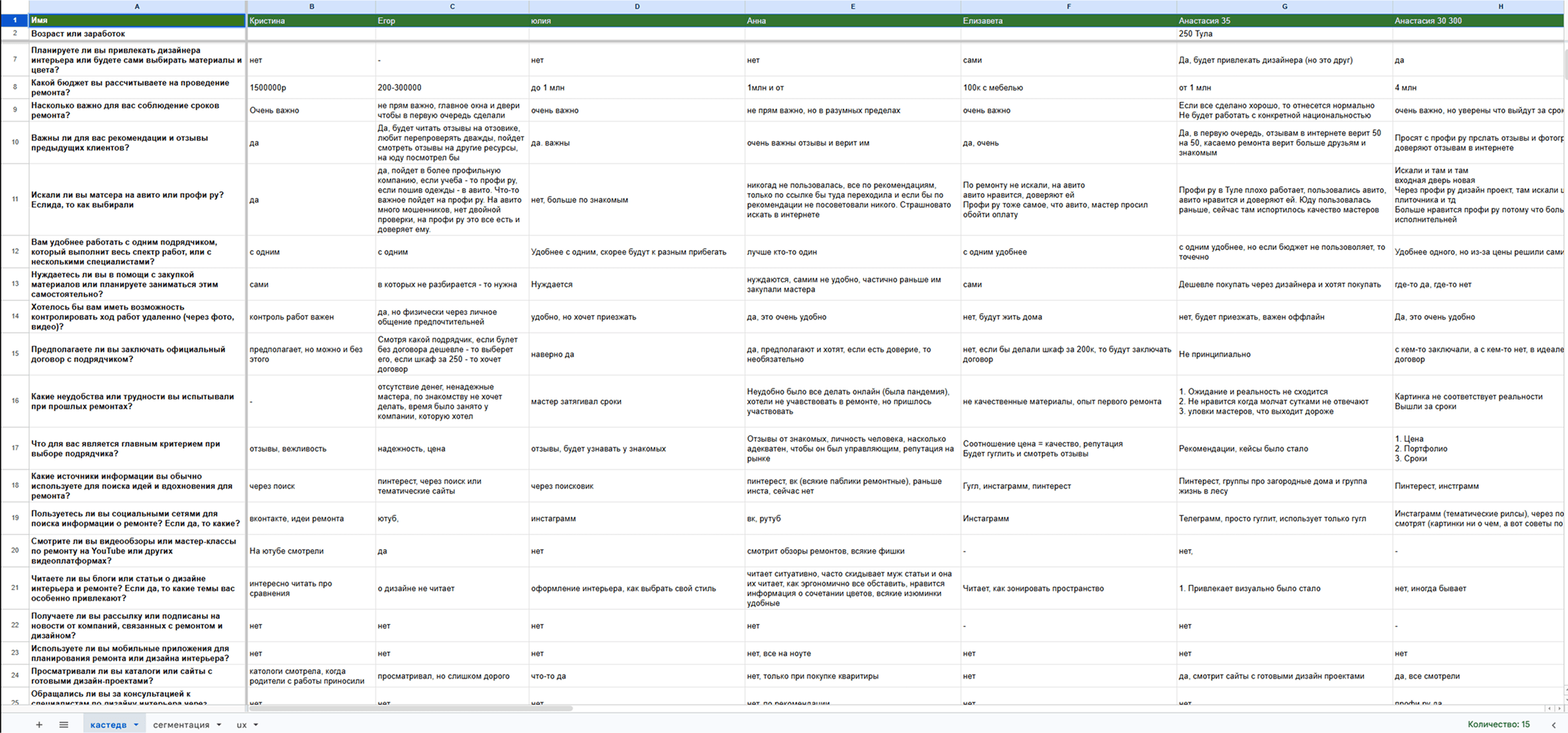
- User researchInterviews with platform users and people unfamiliar with the product, reviews, forums, session recordings and the metrics we had collected so far.
- Competitive analysisIdentifying direct competitors and services with similar functionality, analyzing their approaches and adapting relevant solutions.
- Defining Job StoriesSo every decision could be tested against the job it needed to accomplish.
- Information architecture and responsive designThree levels of entry pages, the job-posting form, and the response page—designed for web and mobile in parallel.
- Design-system developmentI refined shared components, which accelerated implementation.
- A/B testingHomepage versions, the job-posting form, and landing-page templates.
Understanding the domain
How the category, seasonality, roles, and professional selection work.
I started by learning how the market worked, how customers found professionals and what distinguished the main user groups.
4 ways to choose a professional
There are four common routes: ask someone you know, search the web, browse a directory, or post a request. The first beats the others, so the platform is competing less with websites than with “I’ll ask around.” That raises the bar for trust.
6 service categories
The six main areas are design, renovation and finishing, construction, custom furniture, stone products, and other services.
3 seasonal dips across two years
Demand runs almost year-round because outdoor work and interior finishing offset each other. Yet two years of platform data show three dips: January through March, long public holidays, and summer. The summer dip is different: demand is low not because work has stopped, but because projects planned and posted in spring are already under way.
This has two implications:
- Customers arrive during planning, not execution.
- A release landing in one of those dips cannot be judged by absolute numbers; it must be compared with the same period a year earlier.
3 variables used to segment demand
They use job type, budget, and urgency. But our customers arrive without a budget or a precise brief, so there is nothing useful to filter by. That led us to guide them through describing the job instead.
4 roles with different behavior
Visitor, customer, professional, and moderator. Customers appear only when they have a job; professionals return daily. Their conversions cannot be combined in one report, so I added user type to the analytics taxonomy.
User research
Understanding how customers approach their projects, what concerns them and how they describe what they need.
I drew on several sources:
- 40+ interviews with platform customers.
- 20+ interviews with people in our target audience who had not used the product.
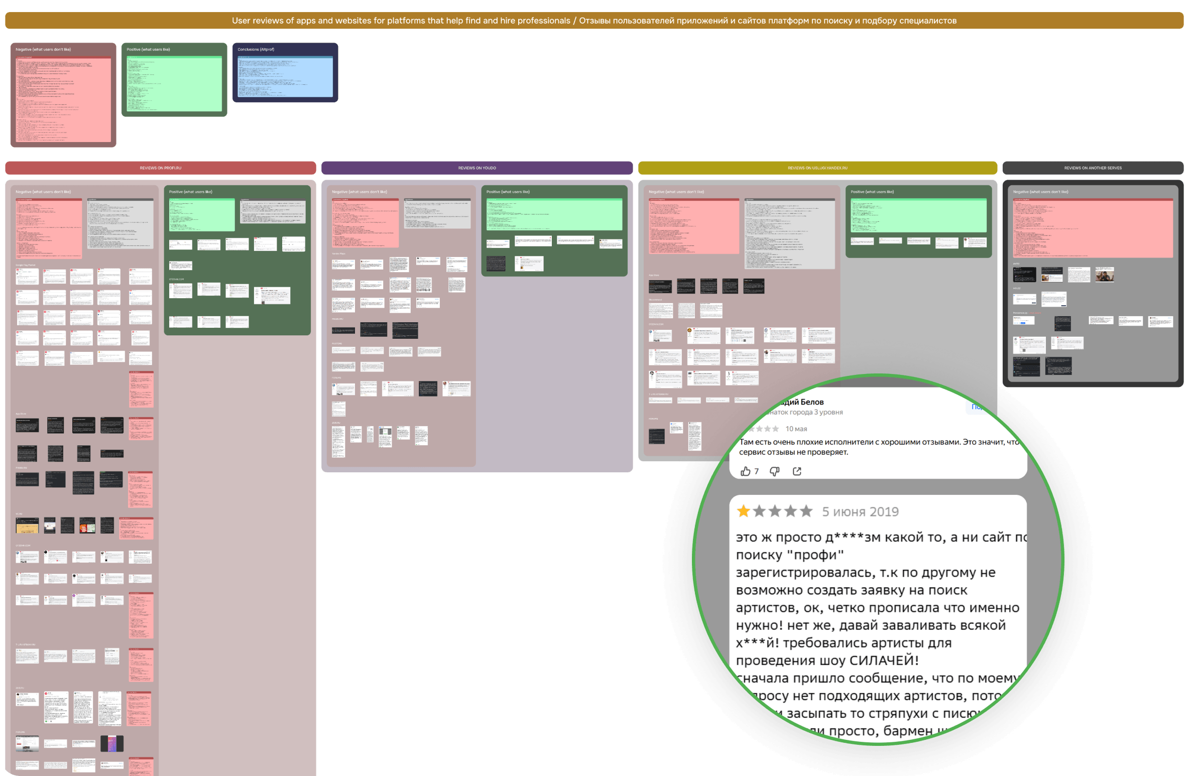
- Reviews of Profi.ru, YouDo, Yandex Services and similar platforms.
- Reviews and comments on marketplaces selling furniture, renovation products and building materials.
- Discussions on forums and social media.
- Product metrics, click maps and scroll maps.
- Feedback from the moderation team.
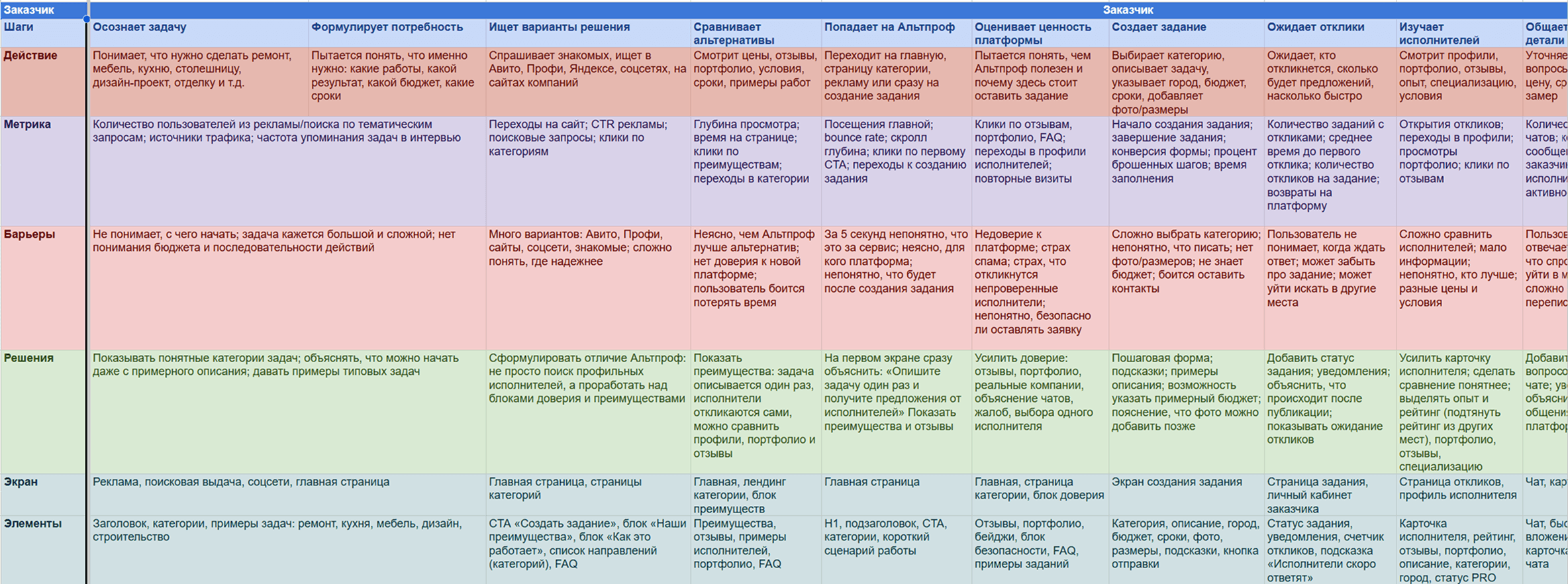
This helped me understand how customers described their projects, what worried them about choosing a professional, where they spent unnecessary time and where they most often abandoned the form.
User-research findings
Customers are not experts—and do not want to become experts.
Customers do not know typical prices or professional terminology, and they are not always sure how to assess a professional. One of the most common things I heard was: “I don’t know what it costs. That’s why I’m here.”
People rarely decide in a single visit.
A customer might explore the options, leave to think or discuss them with family, then return a day or two later. The journey needs to support more than one session.
Customers worry about losing control of their contact details.
A common complaint in competitors’ reviews was that calls started as soon as someone left a phone number. Before publishing, people need to know who will see their details and when they can get in touch.
Generic promises do not build enough trust.
Claims like “reliable professionals” are less useful than concrete evidence: prices from real jobs, reviews of completed work, timelines and information about the professional.
Competitive analysis
How other services handle similar tasks and which problems keep recurring.
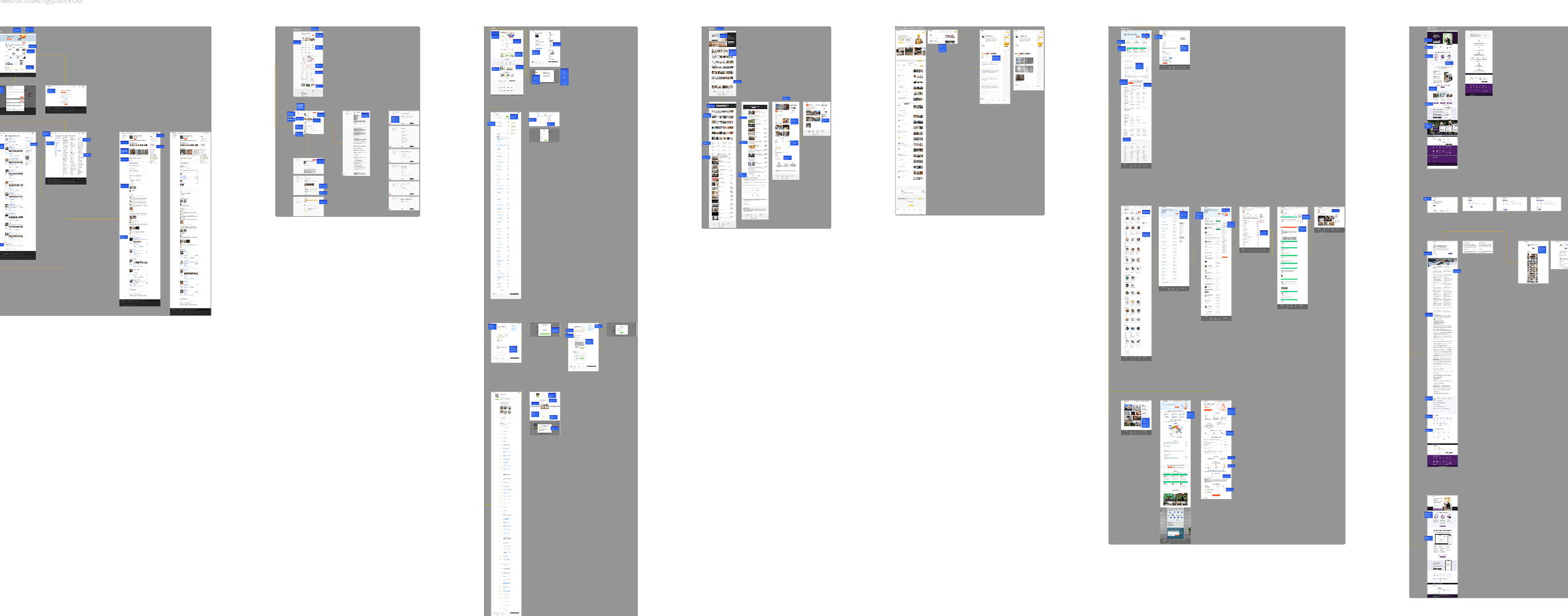
The founder and I identified the direct competitors. I compared services that worked with similar audiences and competed for the same customer needs.
I also looked at products with a similar flow: a user submits a request, receives several offers and chooses between them.
Direct competitors
 Profi.ru
 YouDo
 Yandex Services
 Houzz
 Petrovich Marketplace
 My Hammer
Similar flows
 Avito
 FL.ru
 hh.ru
 ozon
 airbnb
 Aviasales
Competitive-analysis findings
The business model shapes what a platform can promise customers.
A service that takes a transaction fee can be involved in payment, acceptance of the work and dispute resolution. A service that sells professionals access to jobs usually stays outside the transaction. Altprof uses the second model.
Paying to respond affects the quality of offers.
A professional pays to send a response, not to win the job. They need to understand the scope and estimate the cost quickly. If key details are missing, they either send a vague offer or skip the job entirely.
Concrete evidence builds trust more effectively.
Documents, tax registration numbers, licenses, photos of completed work and reviews tied to specific jobs tell customers more than claims like “verified professionals.”
Strong promises use specific numbers.
Instead of just “fast” or “easy,” services promise “responses in 30 minutes,” “post a job in 3–4 minutes” or “over 3 million professionals.”
Offers are difficult to compare.
Prices, timelines and other terms are buried in separate cards. To compare offers, customers have to open each one and remember the details.
Jobs with no responses often come with no explanation.
Customers can see that no one has responded, but not why or what they could change to attract offers.
Defining Job Stories
The needs and conflicting interests that shaped product decisions.
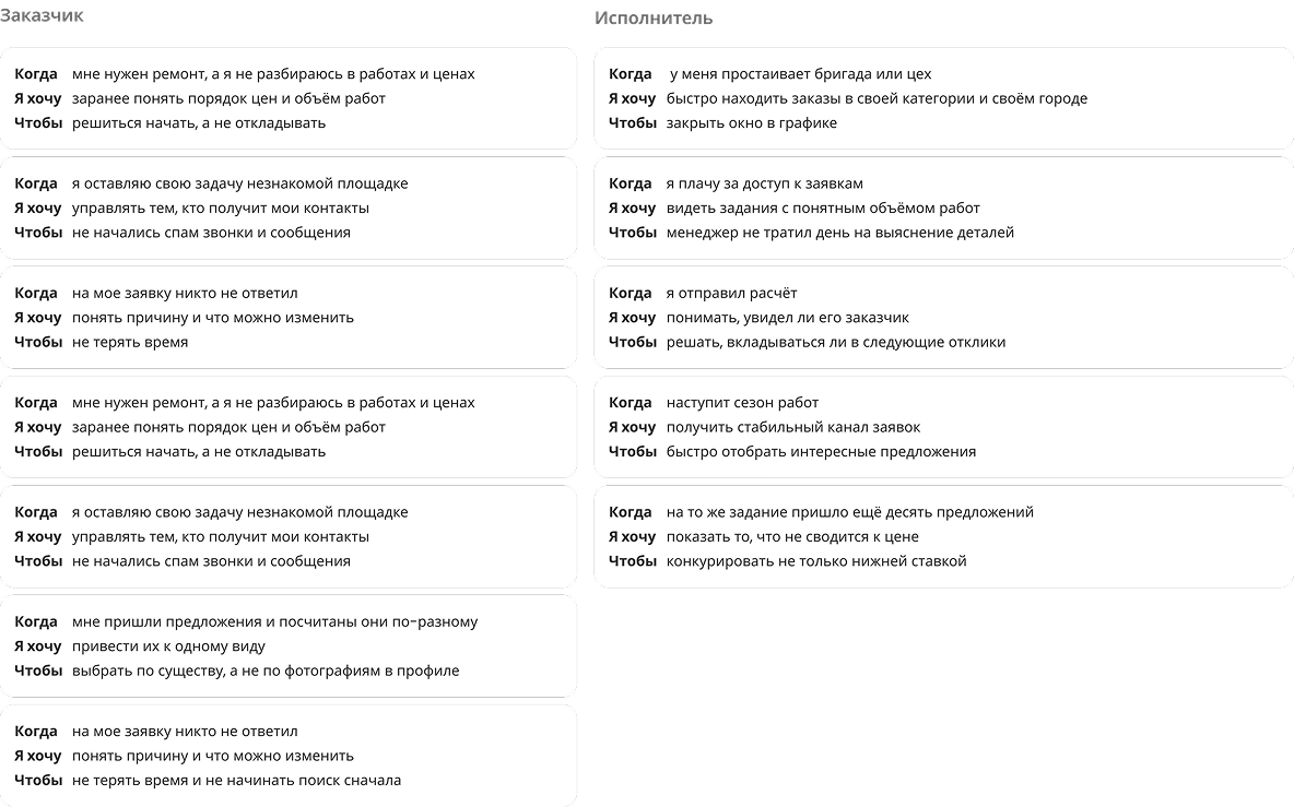
I developed separate Job Stories for customers and professionals, drawing on interviews, reviews and comparable services. The two sides have different needs and constraints. Their conflicting interests led to the most important product decisions.
Job Story findings
Customers want to describe the work in their own words; professionals need enough detail to quote.
Customers do not always know the terminology or required specifications. Professionals cannot estimate scope and cost without them. The form could neither read like a technical questionnaire nor be entirely free-form.
Professionals want to know what happened to their offer; customers do not want to reply to everyone.
A “viewed” status helps professionals but creates an expectation of a reply. I needed to give one side more visibility without creating extra obligations for the other.
Professionals want contact details early; customers want to decide when to share them.
Direct contact helps professionals discuss the job sooner. For customers, sharing a phone number early risks unwanted calls. The timing could not be based on only one side’s interests.
Hypotheses and prioritization
How I decided what to test first and which metrics to use.
I developed hypotheses for different stages of the journey and scored them with RICE: how many users a change would reach, its likely effect on the target metric, the strength of the evidence and the effort required to deliver it.
I used RICE to compare hypotheses and decide the order of testing, rather than treating the score as an automatic decision.
Showing price examples before the form should encourage more users to start, because they will have a clearer idea of the cost.
Visit → form start
Making the exact budget optional and showing a range for similar work should help more customers finish posting without a noticeable drop in job quality.
Start → publication + share of jobs with responses / rejected in moderation
Moving registration from the beginning of the form to publication should help more users finish. Contact verification should keep spam at the existing level.
Start → publication + job rejection rate / successful verification
A consistent offer format, with comparison by price, timing and other key details, should make it easier to choose a professional.
Share of jobs with a selected professional
For this case study, the scores are normalized to a maximum of 100. Absolute Reach figures are omitted under NDA.
I cover three parts of the funnel below. Each involved options pulling in different directions: problem → alternatives → decision and its trade-off.
Homepage
Making job posting the homepage’s primary flow.
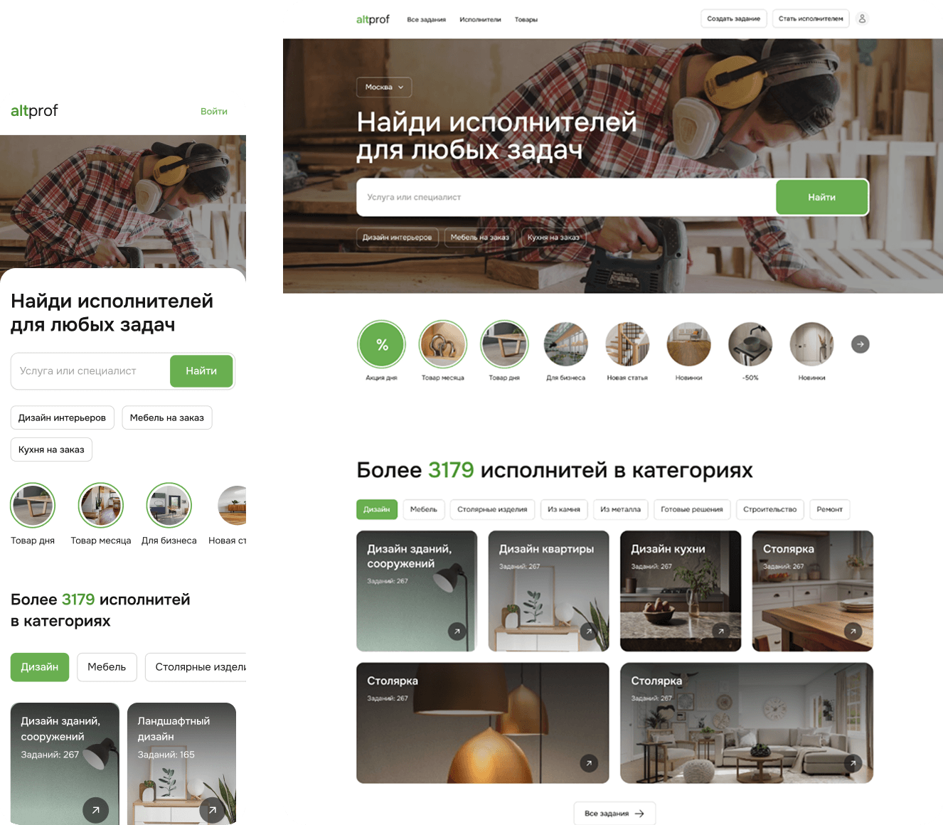
The MVP homepage offered a professional search, a product catalog and job posting at the same time. Customers had to choose a path before they understood what they needed.
Research showed that customers often lacked the terminology, a sense of pricing and professional selection criteria. I gradually rebuilt the homepage around one primary flow: describe the work and receive offers.
Version 1 (MVP)
- Search was the main entry point, but search works when people already know what they need.
- A product catalog on the same page took users into a separate flow.
- “Over 3.179 professionals” conveyed the platform’s size, but not how it could help with a specific project.
- The homepage did not answer two common interview questions: roughly how much will this cost, and what happens to my contact details after I post?
Version 2
In the next version, I tested two ways into the product.
- A directory is familiar, but it asks customers to choose a professional using criteria they often do not yet have.
- Posting a job requires no such expertise: customers can describe the problem and receive offers from suitable professionals.
- I made job posting the primary flow and kept the directory as an alternative.
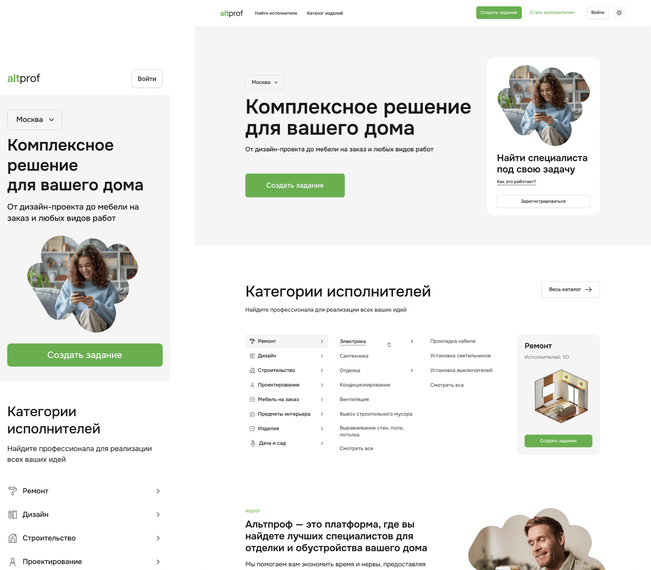
Version 3
In the third version, the entire homepage is organized around the customer’s task.
- The first screen invites customers to describe the work and receive prices and timelines from professionals.
- Completed jobs with real prices and timelines replace the count of registered companies.
- Before the form, a new section shows price ranges based on completed jobs.
- The page explains who will receive the customer’s contact details and when.
- Separate category pages show relevant examples, prices and content without overloading the main homepage.
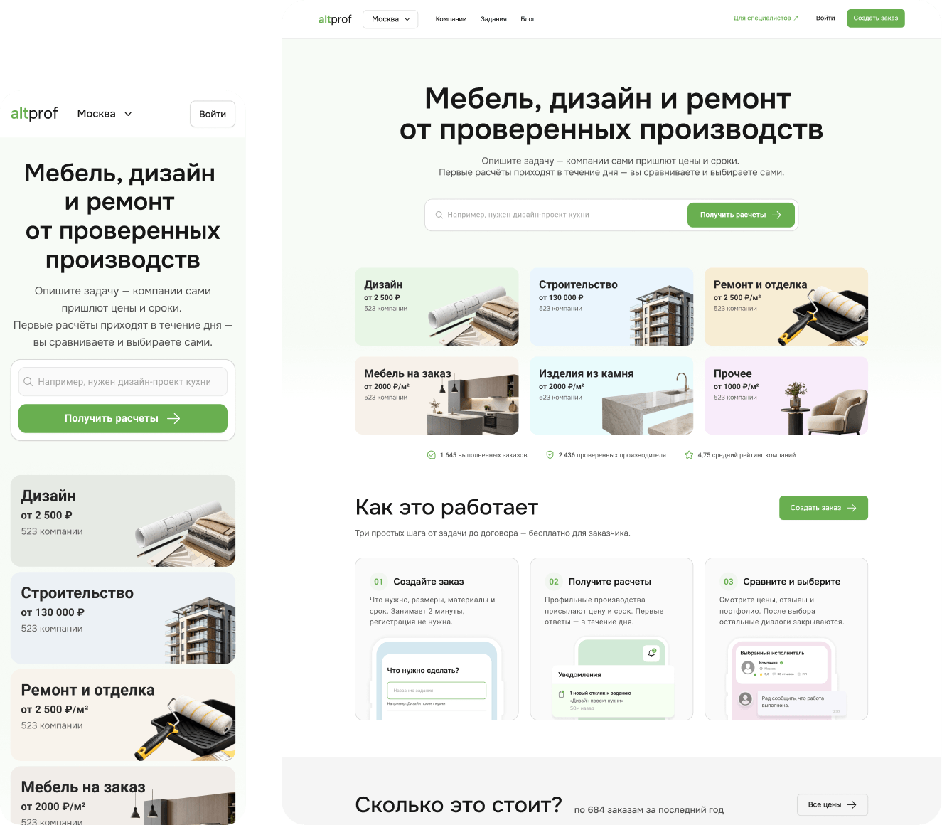
What I learned from the homepage
Start with the task, not the choice of professional.
Most customers arrive without a ready-made solution or professional selection criteria. The main flow should let them explain what needs doing, rather than ask them to find a specialist themselves.
Show a price range before the form.
Cost uncertainty starts before customers begin posting. Ranges based on real jobs give them an early reference point and lower that barrier.
Build trust before asking customers to publish.
Real projects, prices, timelines and a clear explanation of what happens to contact details answer customers’ questions better than company counts or generic promises.
Give the homepage one primary flow.
Search, the product catalog and job posting competed for attention. In the new version, posting a job became the main action, with other ways to find a professional kept as secondary options.
Getting customers to the form was only the first step. The next problem was completing it.
Posting a job
Simplifying the form while keeping the information professionals need to quote.
The original form had five steps. Customers often did not know the precise category, budget or technical details of the work. The more we asked before publication, the more likely they were to drop out. Many left after the third step.
A completely open description would not solve the problem either: professionals need basic details to understand the scope and estimate the cost.
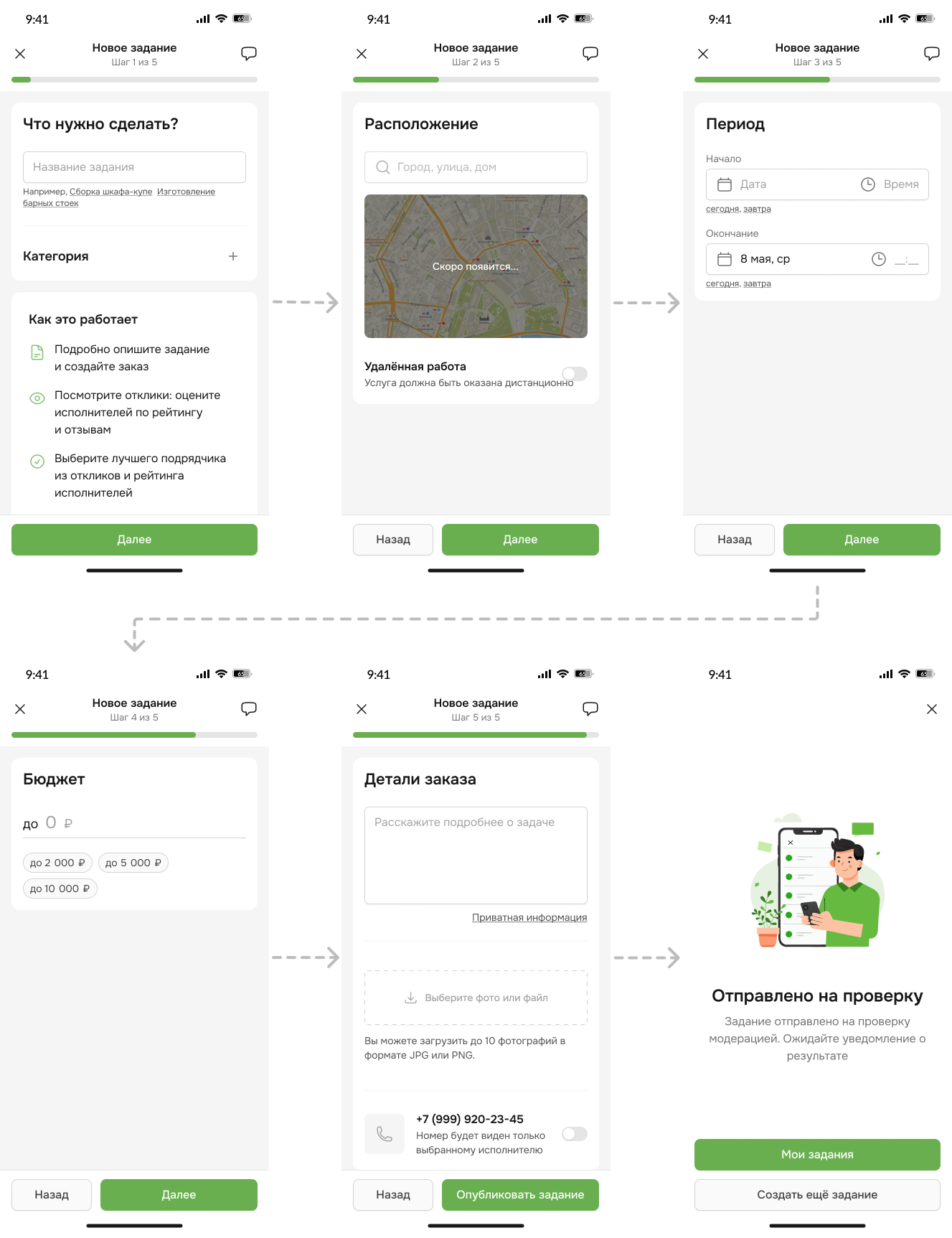
Version 1 (MVP) — five steps
In the first version, customers worked through five steps in sequence.
The job was then sent for moderation.
The issue was not just the number of steps. From the outset, we asked customers to make decisions without enough information: choose a precise category, set a budget and describe the work using the platform’s terminology.
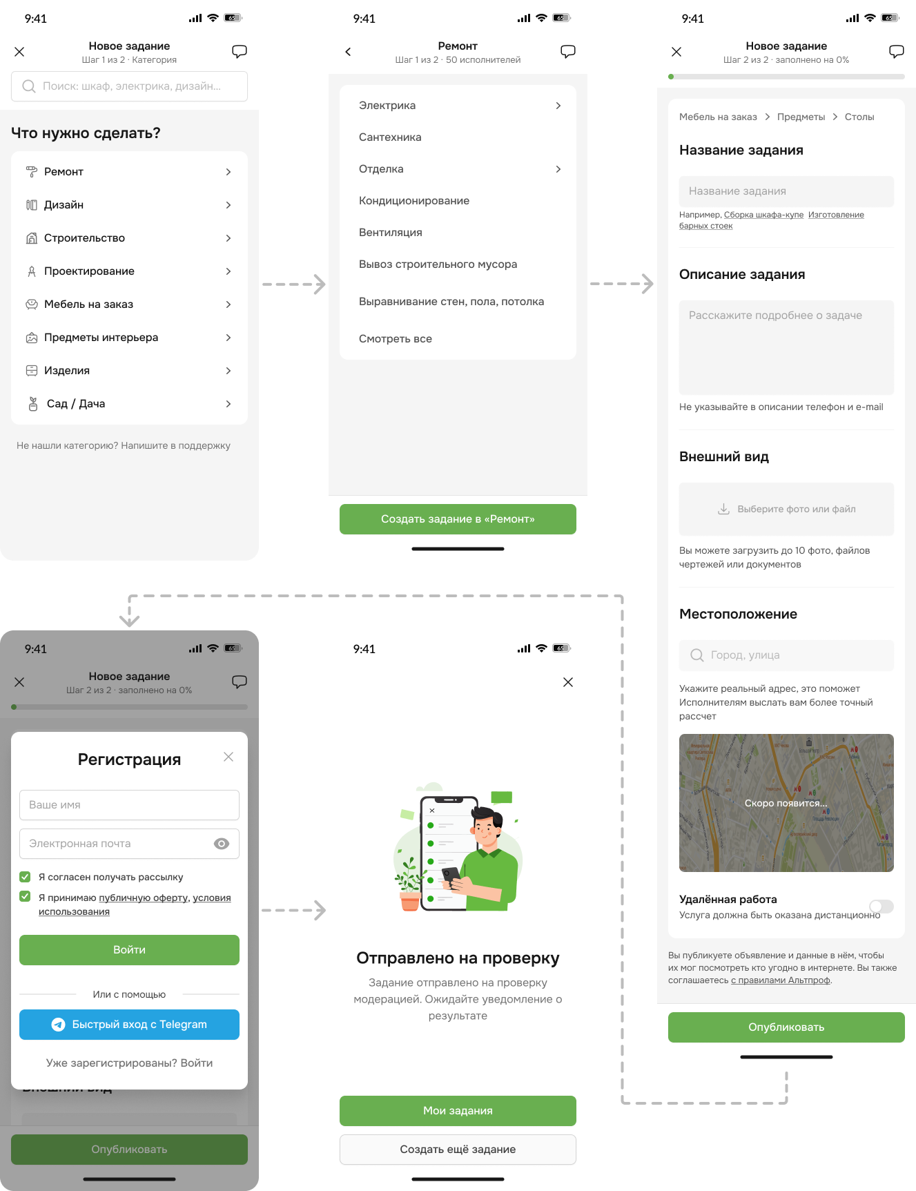
Version 2 — two steps
My next hypothesis was to reduce the number of screens, taking inspiration from Avito’s form.
Customers chose a category in the first step. In the second, they entered the description, location, timing, budget and other details on one page.
The form looked shorter, but the work for the customer barely changed. The same questions remained, now on a single screen. The expected conversion increase did not materialize.
This showed that the number of steps alone was not the problem.
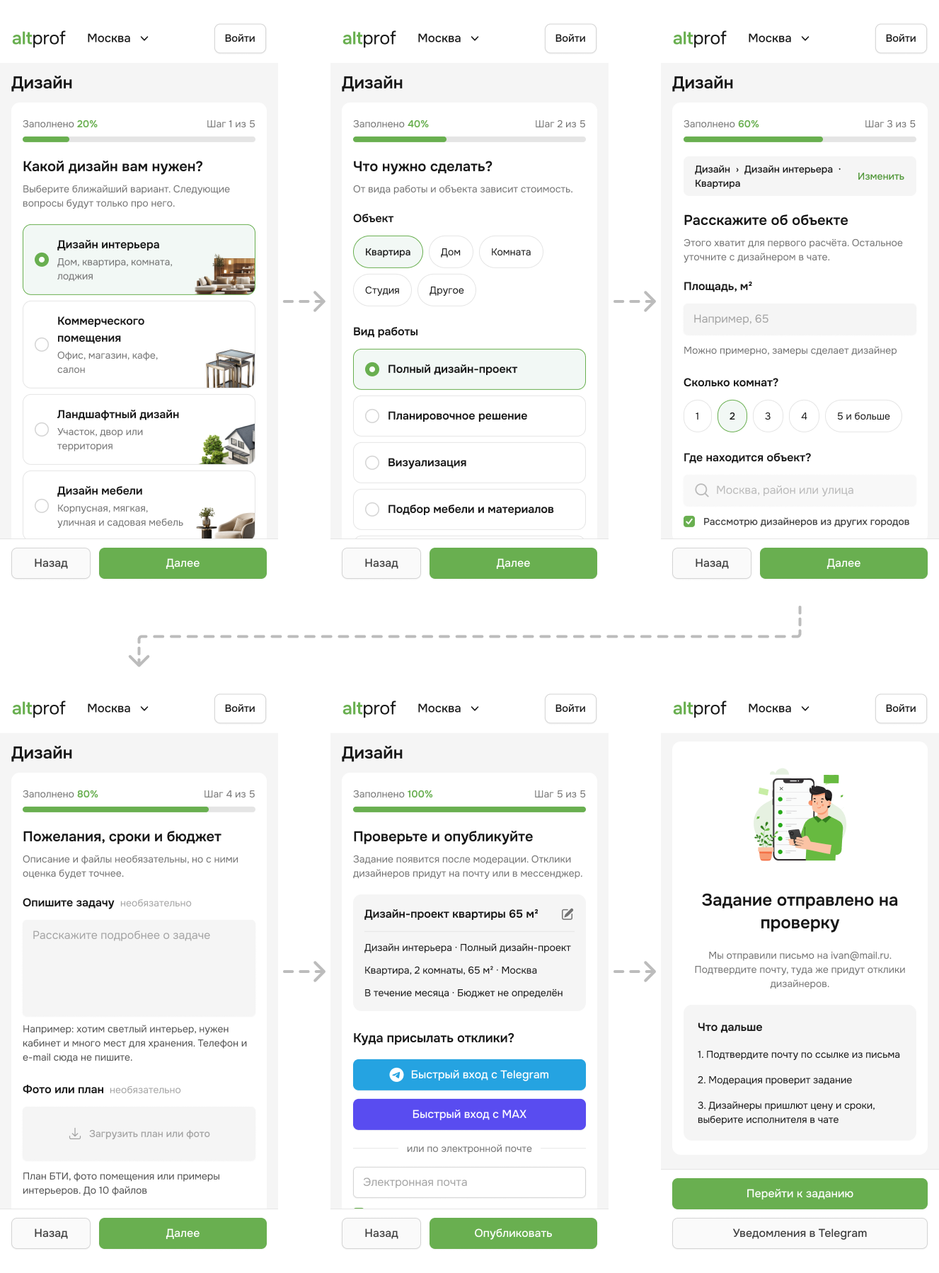
Version 3 — questions tailored to the job
Building a separate form for every category was too expensive. I defined category-specific flows for the main services and wrote the requirements for a Marquiz integration.
Instead of a universal set of fields, customers answered a few questions relevant to their project. Renovation and furniture jobs, for example, required different details.
I drew on the approaches used by Profi.ru and YouDo but deliberately kept the questionnaire shorter. The aim was to collect only what a professional needed for an initial estimate.
We stopped expecting customers to understand how the work was categorized and instead guided them through simpler questions.
What I learned from the form
Step count alone does not determine a form’s complexity.
Moving from five screens to two did not solve the problem because customers still faced the same difficult questions.
Specific questions are easier to answer than a generic form.
It is easier to give a room’s size, the type of work or the desired outcome than to work out which details a professional needs.
Keep the job-posting questionnaire short.
More detail makes quoting easier for professionals, but increases the customer’s workload and the risk of abandonment. We kept only the details that materially affected the initial estimate.
The form should translate the customer’s task into information a professional can use.
Customers describe the problem as they understand it. The product needs to turn that description into enough structured information for a professional to assess the work.
After publication, the next challenge was helping customers compare the responses and choose a suitable professional.
Choosing a professional
Making it easier to return to a job, compare offers and choose a professional.
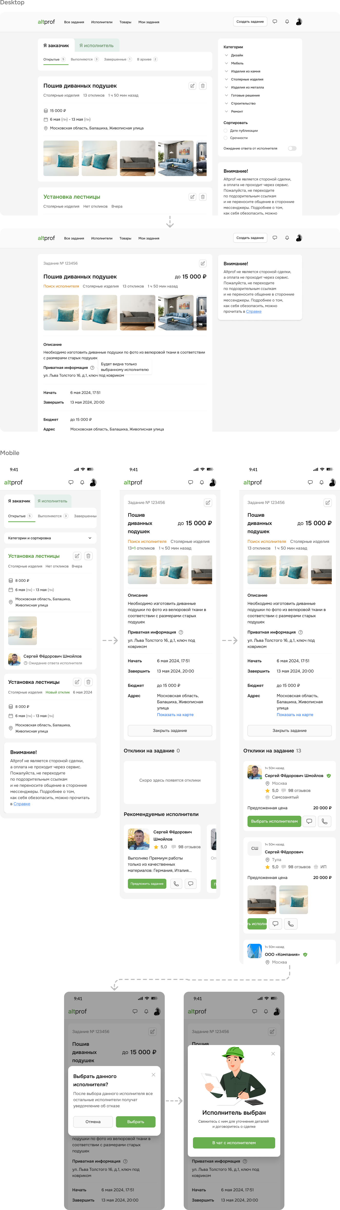
Interviews and support requests revealed the same problem: customers did not always know where to find their jobs, how to return to responses or how the offers differed.
Version 1 (MVP)
- “My jobs” was separate and difficult to find.
- Responses were hard to compare quickly.
- The card did not present the offer in a clear structure.
- New responses were easy to miss.
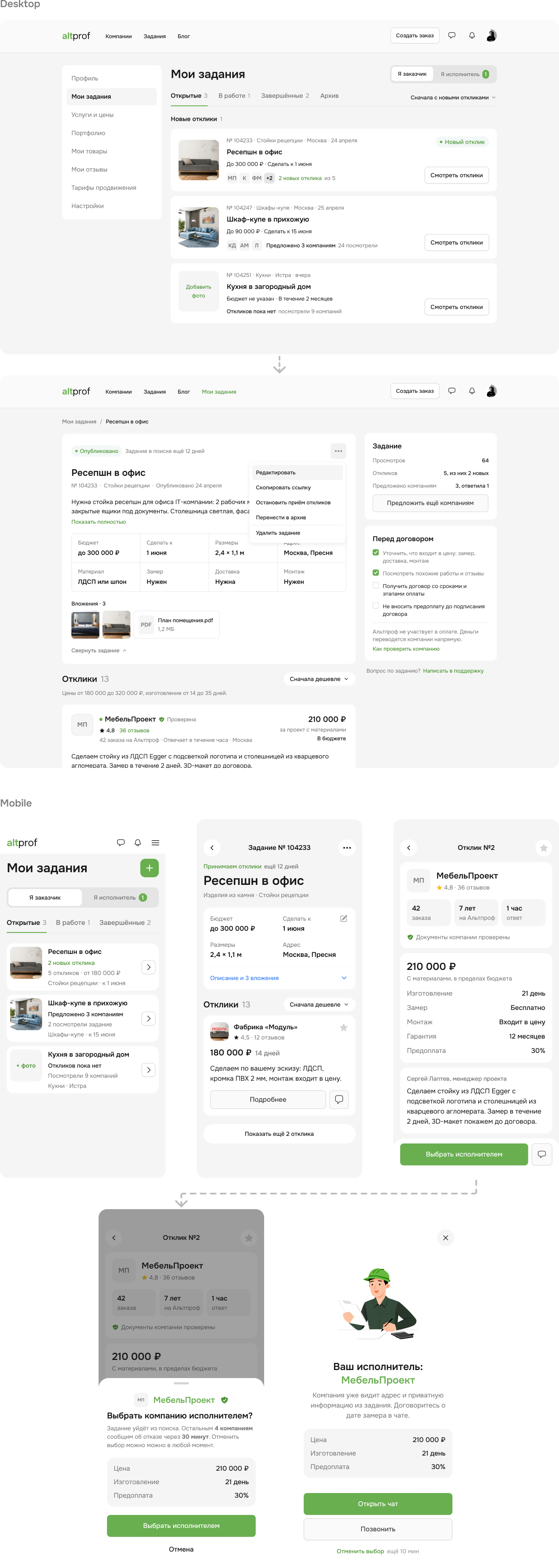
Version 2
- Moved “My jobs” into the profile.
- Redesigned the offer card and made prices visible in the list.
- Added filters and sorting.
- Made new and unread responses stand out.
- Designed notifications and a direct route back to the relevant job.
What I learned from professional selection
The problem was not just offer quality, but a fragmented journey after publication.
Customers received responses but did not always know where to return or how to continue. I brought jobs, responses, statuses and communication into a more coherent flow.
A list of professionals is not enough to support a decision.
Customers need consistently presented details to compare: price, terms, professional information and response status. I standardized the cards and added filtering.
Receiving an offer does not complete the journey.
After the first offer, customers need a reason to return and a clear next step. I added notifications, new-response states and a way to contact the professional directly.
No responses became a supported state too.
Instead of a dead end, customers can update their job with details professionals may need to provide an estimate.
Results
What changed across the journey from the first visit to professional selection.
Lessons learned
Most decisions had to fit a limited budget. We could not always build the ideal flow immediately, so I chose approaches that let us test hypotheses sooner. For example, we first built category-specific flows in Marquiz instead of developing separate forms within the product.
Not every change could be measured in a controlled experiment. Paid traffic was intermittent, its volume and sources changed, and parts of the early funnel were not instrumented. Where there was no A/B test, I do not present correlation as proof of impact.
If I started this product today, I would set up measurement first. Before active development, I would define the core funnel, events, a baseline for each stage and the conditions for testing hypotheses. In parallel, I would assess acquisition economics and demand in the main categories. That would reduce the number of decisions made with incomplete data.